
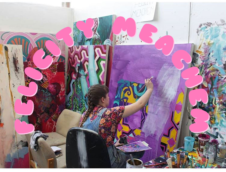
Day need a bit of brightening up? Look no further than our Artist Feature number 17, Felicity Meachem! Working from Brighton, and a recent graduate, Felicity’s work blurs the line between recognisable and unassimilable cultural symbols. With extremes of colour and pattern and a feeling of excessive movement, her work is an assault on the senses (in a really good way).
Hello! Will you tell us a bit about yourself, what do you do and how you would describe your work?
My name is Felicity MeachEm, (the capital letter is just because people often spell my last name wrong with an 'a' instead of an E. And if you’re going to be an artist people have gotta get your name right, right?
I’m a Fine Art Painting student at the University of Brighton.( If you haven’t already guessed from my paintings, I love pattern, decoration and I’m drawn to what I feel is 'exotic'. This isn't only in my paintings, but in my dress sense and possessions too. I’ve lost track of which influences which! I’m like a magpie collecting many shiny things! Not to mention my glitter collection…
When did you start creating art?
I’d say I started to get excited about making art when I was 16. It was at that age that I decided to go against the norm and conquer my own personal qualms. My use of pattern began when I discovered William Morris on my Art Foundation in Norwich. At first, this became a pursuit of pleasure; my adolescent hedonism on canvas. But it was more than that, it was a safety blanket, my never-ending ‘sanguine’ project.
I’d say I started to get excited about making art when I was 16. It was at that age that I decided to go against the norm and conquer my own personal qualms. My use of pattern began when I discovered William Morris on my Art Foundation in Norwich. At first, this became a pursuit of pleasure; my adolescent hedonism on canvas. But it was more than that, it was a safety blanket, my never-ending ‘sanguine’ project.

Are there any particular elements you enjoy working with most?
I have varied techniques and so I love contrasting these together. The first thing I do is I go crazy and paint an expressive coloured ground and this is my opportunity to pretend that I’m an abstract expressionist painter…. Then, I love the feeling of painting over a geometric pattern with a coloured glaze (made of dammer varnish, turps and linseed oil) It's so satisfying because every section becomes a different colour - its like magic!. Also, Alkaflow is my favourite thing at the moment. Its a spectrum medium that dries oil paint fast and leaves a gloss finish.
Where do you find the inspiration for the patterns that are often embedded in your work?
I intentionally seek out patterns that come from different cultures and then create an amalgamation of different ones. I manipulate their colours and form but never to an extent of becoming unassimilable. A lot of people ask me, why are you so damn crazy about pattern?? And for a while, it's not something I was totally conscious about. But it might be to do with having lived in the remote countryside in Norfolk for most of my young adult life. I often felt quite cut off from things, missing out on important life experiences, having to depend of my Mum a lot. And so I developed this taste for what I felt was exotic or unusual, I would collect anything patterned or heavily adorned. From clothes to trinkets to my duvet covers. It reminded me that I wanted more and to be more than my countryside bubble. I want to explore the world and to see many many lovely things.

Do you feel that Brighton has good opportunities for young artists?
Yes absolutely. I’m a little biased but I think that Brighton has one of the best Fine Art Painting courses in the country. Its liberal, super friendly and there’s no house style.

Yes, Brighton does seem to churn out SO many amazing artists! Have you got any exhibitions/collabs coming up?
A couple of painters and I are thinking of setting up a show in Brighton after our degree show for in-between works that haven’t had enough attention. I can’t say more than that but watch this space!
A couple of painters and I are thinking of setting up a show in Brighton after our degree show for in-between works that haven’t had enough attention. I can’t say more than that but watch this space!
Have you ever experimented with any other art forms?
I often collage images together to inform my practice and create a mock-up before I start painting. Usually this is done on photoshop, as images can be manipulated more easily. I’m quite a keen photographer, from photographing masquerade balls to photographing everyone’s paintings on our course for our Degree Show Catalogue. I make the odd film but mostly for fun and nostalgia!

Would you say you try and get specific themes across in your work?
Burgeoning with an overload of pattern, my work explores whether the decorative has a place within contemporary Fine Art Painting. While pattern can still signify twee, kitsch, the degenerate and the feminine, all of the old disparagements which critics imposed against it, with the right use of decoration in painting it can be evocative, multivalent, vigorous and empowering.
Images sourced or appropriated from different cultures define the subject matter in my paintings, such as Parisian tile patterns, a Chinese sabre tooth tiger, Japanese Kimono and iconic African Dutch wax prints. This is in order to create a utopian world where all cultures can live in harmony. My work highlights the unavoidability of politics. I’m aware that by contrasting and balancing different cultural iconographies, from western illusionism to non-western patterning, it can be quite contentious. Especially with its relation to ‘Orientalism’. However, in opposition to this, I wish to investigate the complexity of cross-cultural fertilization. And I strongly believe that internationalism of pattern work is a cultural fabric that overlaps!
Homi K Bhabha’s central idea of ‘hybridity’, an emergence of new cultural forms from multiculturalism, is a central theme in my paintings. This term presents a creative way of expressing cosmopolitanism and eclecticism. In postcolonial discourse, the notion that any culture or identity is pure or essential is disputable. Bhabha himself is aware of the dangers of fixity and fetishism of identities within binary colonial thinking arguing that all forms of culture are continually in a process of hybridity. This I have learnt from my own encounter with an individual who felt strongly that a pattern within my painting was Islamic and from their culture, when in fact it was of Chinese origin. This shows that through the scope of someone living in the 21st century, authorship is lost in translation.
It's interesting to see how critical theory influences your work. How would you say your personality reflected in your work?
I often like to think that my paintings are self-portraits without actually having to paint a self-portrait. Although I don’t tend to think about it too much. I am a feminist painter. Growing up, it felt hard to be in my own skin, I felt ashamed to be feminine, to wear skirts or makeup, and compared to my friends I was a bit kooky. Moving to Brighton, where it seems like anything goes, I completely broke free of that mentality, and I suppose in a way my paintings are a celebration of it being okay to be different.

Yes, your use of colour is very striking. How do you decide which colours to use? Is it a thought out process or more organic?
Yes, often people find them over-powering! I go to the ultimate maximisation of colour and pattern on purpose and keep pushing it… Some have said that it goes to the extent of even being vulgar or grotesque. I like that even though my figures are in a state of reverie, they carry a weight of ecstasy as well as something that is slightly more dissonant. My colours are mostly generated through playing around with the hue settings on photoshop and then translated into paint. These mostly stay the same or are saturated even more with colour straight out of the tube.
Well, I’m quite the compulsive list maker, although I tend to leave them lying around and forget where I put them... I’d usually go back to the drawing board, go to the library and find books on patterns, start playing around on photoshop, that usually sparks my interest. I think as well the best thing for a block is to go and visit art galleries and see paintings in the flesh, to remind myself why I love painting!
Who are your favourite artists?
I adore Matisse! He was the true master of merging and elevating the decorative into Fine Art. I believe one of the most underrated artists is Miriam Shapiro, a leading artist from the American Art Pattern and Decoration Movement (often called P&D) that emerged in the 1970s in reaction to of macho styles such as Minimalism and conceptualism and was inspired by the 1960s liberation politics, especially feminism, as well as by African, Middle Eastern and Asian Art. Although she risked being too overly effusive within her work, she proved that a woman can have ‘strong, male-assertive, logical, measured and reasonable thoughts in a female body’.
You can find more of Felicity's work on her Instagram @felicitymeachempainting, or on her website: felicitymeachem.com


Post a Comment